

Othello


Artwork, Brand Identity, Concept, Web Design
On Board Othello
For over 100 years, the Rainier Valley, of which the Othello-Graham area is arguably the heart, has been a landing place for immigrant communities, and an “incubator” of small, family-owned businesses, including farms, restaurants, and specialty shops. Othello is an extraordinarily diverse community, socially and economically, as well as culturally.
Realizing key goals set by the 2009 Neighborhood Plan Update, our job was to crate an identity which supports the ethnic diversity of the Othello merchants and deliver an identity which will be supported and maintained over the years. Othello will have vibrant commercial areas with diverse economic opportunities for area residents, including family-wage jobs and a variety of employment. Along with a multi-cultural core town center around the light rail station this area will be economically strong and serve the community who live, work, and shop here.
An active Othello identity is key to achieving these goals. Othello had a great need for an identity that is a "universal" concept, flexible, forward-looking, optimistic, urban, professional, inviting and fun. Emphasizing uniqueness, celebrating and maintaining diversity, while creating an image of cohesion. This identity must foster community pride and participation, support current businesses, and position the area as a prime clean, safe, & welcoming location for new development, jobs, and a place to call home.
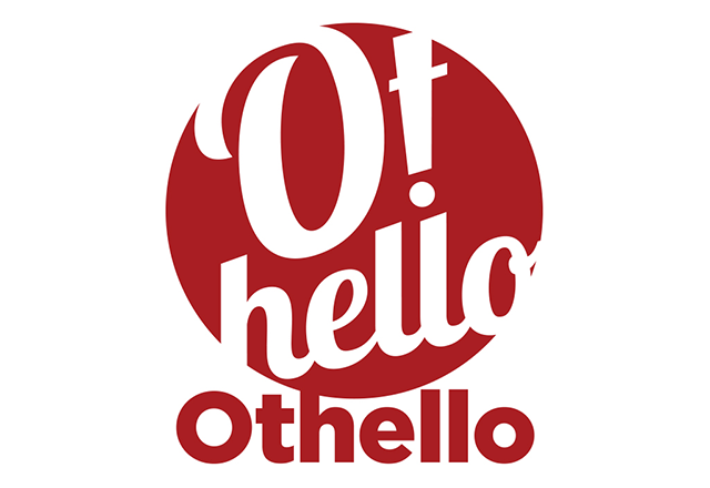
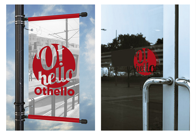
This is a stamp of welcome. An approval. A greeting. An invitation.
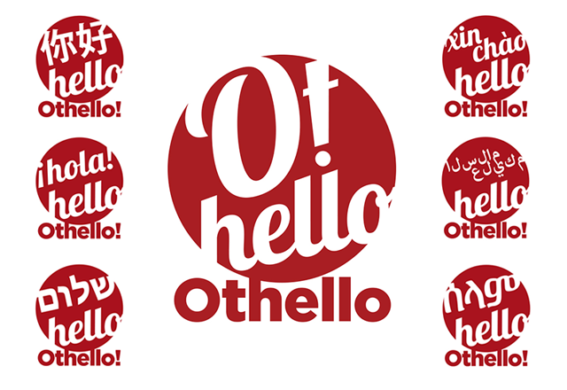
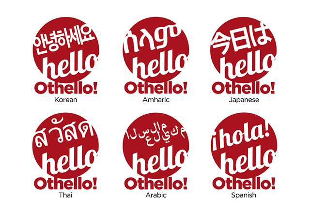
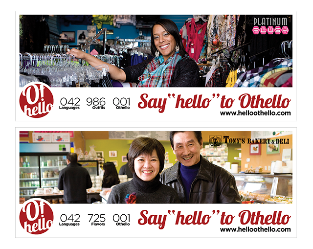
Saying “Hello” is a universal greeting in many languages, and a way to instantly create openness and welcome a relationship. Using this hello concept, we have constructed a flexible logo which uses these translations to highlight the diversity of the area. These translations can be used on promotional and marketing materials. From storefront window clings and street banners, to entire campaigns focusing on native non-english speaking households and businesses, the design will flex for maximum visibility and reach within certain groups.
Design is inspired by Chinese and Vietnamese paper cuts, the rising sun of Japan, the Red Bindi of South Asia. Color Theory – Focusing primarily on the strong Asian community in Othello, we started with the auspicious color: RED. Keyed off the MLKBA color palette with key colors of orange and gray for expansion.
• Red: Red is associated with happiness, love, luck and celebration across Asia
• Orange: Fruit, sweetness, change adaptability (China)
• Gray: Openness (Vietnam), silver and income (China)
We have tagged an additional color palette, “Marrakesh Express”, for expansion within the Othello theme, or across the Rainier Valley.